Thursday, 15 March 2012

illustrated initials- Sketch Book


Coco Chanel was a famous French fashion designer, she founded the house of Chanel in 1910.  The name Chanel became an icon of elegance and from then on, the Chanel logo became identified with elegance, wealth, and elitism as well as a standard for international fashion. The Chanel logo design was designed in 1925 by Coco Chanel herself and has not changed since. It has turned out to be one of the most recognizable symbols in the fashion world with its overlapping double 'C' - one facing forward and the other facing backward. Chanel's logo is frequently seen in perfumes, purses, shoes, and jewellery. I have created my own response to the Chanel logo as part of my development for illustrated initials. I have used black lace and outlined the letters with white beads that give a pearl effect. The reason for this is because Coco Chanel signature colour was black and the use of lace and pearls symbolise the elegance and class of the fashion brand and Chanel herself.


Kurt geiger are a designer shoe brand. The reason I have focused on Kurt Geiger in particular is because it is and example of initials that are recognised everywhere. The logo uses a particular font, but only features the two letters KG on most of the merchandise which is immediately related to Kurt Geiger. I have created my own response to the famous initials by recreating them by using a specific fabric that represents the  fabric that is used on Kurt Geiger shoes. 


I have focused on Roy Lichensteins signature paint style to illustrate his initials.


Here I have taken a different approach and used Lichensteins signature red spots to illustrate his initials.

Below I have used the red dots and signature paint style. I have drawn these with in a speech bubble which is what Lichtenstein used in many of his comic style art pieces. 


I Have also focused on Kay Perry as she is one of my favourite singers and fashion icons. I have illustrated her initials based on her music video California Girls which is a candy land theme. This is one of her most recognised music videos which could be due to her unusual candy themed outfits and hair colours. I have taken the same approach using sweets and bright colours.


Sunday, 12 February 2012

2 History of logos

What is the difference between symbols and logos?

A logo is a graphic representation of an identity. It is composed of a symbol, illustration and/or typography ('logotype')
The word logo means: Name word, symbol or trademark designed for easy recognition.


A logotype is a single piece of type bearing two or more usually separate elements. Also another name for a logo or the companies signature typeface.

A symbol is something that represents or stands for something else, usually by convention or association, especially a material object used to represent something invisible.

Symbols and logos are not the same thing because a symbol is usually picture that is representing an idea like the name of things, which is often used in pubic signage such as the image that symbolises the male toilet from the female toilet which have become explicit meanings to people. Where as a logo is like someones personal name as it has character and belongs to a company just like a name belongs to an individual. Logos are usually implicit. (Implicit means implied and explicit means when something is stated clearly and in detail)

Example: Nike, like most sports marketing companies, uses implicit advertising rather than explicit. That is, their ads do not directly sell their product, but they get the consumer to think about the product by implying a certain moment of a sports experience. Nike brings out a passion in the consumer that implicitly makes them think about Nike’s product. After exploring Nike’s website, it is easy to associate its products with the like-ability of today’s star professional athletes.

This simple logo has been grained into sport culture throughout the world by using implicit advertising

History of Logo design

The history of logos date back to the Ancient Greeks. The first representations of logos were called ciphers (safe), part of the greek manuscript. Many early greek and roman coins feature the monograms of logos of rulers or towns. The most famous of these is the sacred monogram which is formed by the joining of greek letters; Khristos which means J. Christ.


In the 13th century logo design developed from simple ciphers to trademarks for traders and merchants. The middle ages were extremely prolific in inventing ciphers for artistic and commercial use. The information age changed the face of logo and logo design.


How people identified themselves

A logo is also seen as a simple visual mark to identify a company, product or service. There are different types of signs and emblems easily recognised and associated with various purposes. For example crests are used to identify a country or family. Sometimes big enough organisations could afford to make their own crest, which could be a very detailed drawing with many objects. Then flags were used due to their larger format and because they were visible from longer distances. Another example is road signs which were designed for informational purposes (symbols). Techniques such as contrasting colours, simplified and stylish formats to identify and attract more attention and convey information.


Coat of arms is another historic origin of how people represented themselves. Coat of Arms is a unique heraldic design on a shield used to cover and protect armour and to identify who is wearing it. The design is a symbol unique to an individual person, and to his family, corporation, or state. Historically, armorial bearings were first used by feudal lords and knights in the mid-12th century on battlefields as a way to identify allied from enemy soldiers. As the uses for heraldic designs expanded, other social classes who never would march in battle began to assume arms for themselves. Initially, those closest to the lords and knights adopted arms, such as persons employed as squires that would be in common contact with the armorial devices. Then priests and other ecclesiastical dignities adopted coats of arms, usually to be used as seals and other such insignia, and then towns and cities to likewise seal and authenticate documents. Eventually by the mid-13th century, peasants, commoners and burghers were adopting heraldic devices. The widespread assumption of arms led some states to regulate heraldry within their borders. However, in most of continental Europe, citizens freely adopted armorial bearings.


What is a logo?

Logos are one of the most important elements of a business as they are going to create strong brand recognition. A strong, recognisable logo will make people think of a particular business that offers the product of service they are looking for. For example the McDonalds logo is one of the most recognised all over the world and even though the logo does not illustrate what the company sells, people are still aware what the company sells, this is due to advertising which attracts more customers and makes them aware of the company logo and build a stronger brand recognition.

A Logo is a design symbolizes a business/organization. It is a design that is used by a business/organisation for its letterhead, advertising material, and signs as an emblem, which then allow the organisation to be easily recognised. A Logotype is a graphic representation or symbol of a company name, trademark, abbreviation, etc., often uniquely designed for ready recognition.


Today companies have less time to impress their customers as everything is moving so fast and are continuing to say that 'simpler is better'. Logos today have to be designed in a very stylish way but still remaining conservative so that it is easier for the eye to catch and the brain to memorise the logo. Reproduction costs have to be considered as more detailed and colourful logo designs are harder to reproduce and they cost more money. The size also has to be considered as logos are usually featured on stationary.

Monday, 6 February 2012

WEDNESDAY 3

Below are my examples of how I made a little 8-page book out of one sheet of plain A4 paper. 
  1. firstly I folded the paper in half three times so that the page was divided into eighths 
  2. Then I Unfolded the whole sheet all the way, and then folded in half once. Using scissors I cut on the crease from the fold to the centre, so that when unfolded only the middle section of the paper has a cut.
  3. Once the middle was cut I then unfolded the paper and folded it again lengthwise, so that the cut  made is at the top. By pushing the ends together the cut forms a diamond and to create the book i kept pushing them together until it went flat. I then creased all folds and created the book.


Using InDesign, I created and used this template to place text and pictures on the book before folding the book up.

These are examples of the two books I made using Indesign and the layout, before I printed and folded them to turn them into mini books.


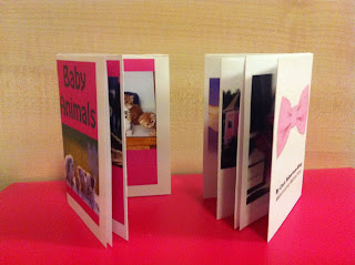
These are images of my completed mini books. The one on the right is a mini book of pink things and the book on the left is a mini book of baby animals. This technique is good for leaflets, information and advertising, as the books can be unfolded and could feature a poster, map or even fold the opposite way to create a completely different book.

Wednesday, 1 February 2012

WEDNESDAY 2

 I have experimented using In design and the different ways of presenting type. This first image is evidence of how I have experimented with the different character styles by using each one separately for example the top wording is all caps where as the last wording I have applied more than one character style (small caps, subscript and italics). These tools are useful when text is needed to be edited quickly from its original format for example if text has been written in lower case and needs to be changed to caps. i have also used an example of how to scale text, by using the Vertical Scale and Horizontal Scale options in the Control panel.
Here I have experimented with the paragraph and alignment tools available in InDesign. These tools are used to create the best line breaks and optimal word spacing of paragraphs, which are useful tools when designing the layout and style of text. I have used placeholder text which is American Latin words, this is useful as it allows me to concentrate on the layout rather than the text its self. I have been able to make the text from one text box flow into another by clicking the small red square and placing the text over the text box i wanted it to flow into. To create a raised cap, I applied a one-character, one-line drop cap, and then I increased the font size of the drop cap character. I did the same with the lower paragraph and then increased the number of characters that were drop cap and decreased the number of lines down that the drop cap went to  decrease the size. 


This example is experimenting by aligning to a decimal point. I have used guides to create invisible margins which allows me to divide the page up accurately using measurements located at the top and side of the document.


To give the text this effect, I have selected characters on the left side of the word and applied a negative skew value of -20, and then I selected characters on the right side of the word and applied a positive skew value of 20.

Basic Paragraph Rules are strokes above and/or below a paragraph that are formatted right into the running text. This means, that unlike drawn strokes, these rules are actually part of the text and will move with a paragraph if copy is added or deleted.  This tool is use full when creating pull quotes in longer paragraphs or throughout articles.


Tuesday, 31 January 2012

2 Shell history

Shell Logo

The name 'Shell' came from a small business in London that originally dealt with antiques and oriental seashells. They started off by transporting kerosene to the far east and in 1897 Marcus Samuel formed The Shell transport and trading company, which used a mussel shell in1901 for the first logo which then changed to a scallop shell which gave a more of a visual element to the corporate and brand name.

 Each of the tankers carrying kerosene to the Far East was named after a different seashell.It is thought that the scallop shell, may have been taken from the family coat of arms of a business associate, Mr Graham, who's family adopted the St james's shell after a pilgrimage to Santiago de Compostela in Spain. Mr Graham imported Samuel's kerosene into India and soon became a director of The Shell transport and trading company. The trends in Graphic design have effected how the Shell emblem has changed gradually. It was designer Raymond Loewy who created the emblem that is still currently being used in 1971.


The reason the colour of the logo is red and yellow is because the Shell company of California wanted their first built service stations to stand out from the competition. In order to do this they used the bright colours red and yellow. These particular colours were chosen because they didn't want to offend the Californian's and because of the states strong spanish connections and they hoped that by displaying Spanish colours an emotional bond would be created. The colours have developed over the years particularly in 1955 when the logo changed to be more consumer friendly and to launch the companies new retail visual identity. Today the scallop shell remains one of the greatest brand symbols of the 21st century.

Thursday, 26 January 2012

WEDNESDAY 1

In Design is a software application produced by Adobe Systems. It can be used to create works such as posters, flyers, brochures, magazines, newspapers and books. InDesign can also publish content suitable for tablet devices in conjunction with Adobe Digital Publishing Suite. Graphic designers and production artists are the principal users, creating and laying out periodical publications, posters, and print media. It also supports export to EPUB and SWF formats to create digital publications, and content suitable for consumption on tablet computer devices. Being first experience using InDesign, I have experimented with the layout, rotation and cropping images into certain sized boxes. 

Below is images of album covers I have experimented with using InDesign and random images and text.


illustrated initials - MT

I have developed the illustrated initials of Mario Testino further by using different images and experimenting with various ways of presenting his initials or name. I have chosen images of Kate Moss because Mario Testino has worked a lot with the model through out his career as has Kate Moss with him throughout her career. I have used the same technique of placing the image behind the text of his name and again with his initials. I do not think this is as successful as my first outcome, where I have used a different image each individual letter. I think this is because the first outcome illustrates a wide range of his work  and shows a variety of his photographs where as using one image is limited. Although I feel it is successful at illustrating his photographic relationship with Kate Moss. Mario Testino has released a book which features his work with Kate Moss, this is relevant as the front of the book cover features the same technique (placing images behind the text) that I have used to illustrate his name and initials. I would like to say this was my influence as to why I decided to use this technique, however, I found this publication after I had created my designs.


I have also decided to use a current image produced by Mario Testino of a current celebrity which is why I have chosen to use an image of Lady Gaga who is a currently a very popular singer and style icon. The image I have chosen is a great example of Mario Testino's use of bright colours and style of the subject, as I thought this particular photograph expressed her image really well with the mass of  platinum blonde hair, futuristic mask and over tanned skin tone which illustrates how her physical appearance always makes her stands out from others. I have used this image to illustrate his name by cutting out his name in white text and using it as negative space with in the image.  I feel this one is more successful than the image being clipped behind the initials as the view of the over all image is limited and not as interesting.


I have used various images that illustrate photographs focussed on makeup art. I feel the initials with image of Kate Moss's eyes are the most successful as the eyes are the main focus of the original image which take up a good area of the initials. I also think the M and sideways T featuring the main features of the face is successful as it is an unusual way of  presenting the initials, compared to the other ideas, which brings me to the image of Princess Diana that has also been presented in a slightly different way to ensure the best part of the image is presented. I have used Princess Diana in particular because she is one of the biggest icons who has been photographed by Mario Testino. 


Wednesday, 25 January 2012

Research

Paul Thurlby
Paul Thurlby is an example of an artist who has worked with illustrated lettering.  The image below is an example of his work, which is an illustrated alphabet, each letter representing a word beginning with that particular letter. 

"My alphabet needed to be different from the many versions around, so I decided to pursue the challenge of fusing the object of the word with the shape of the letter."


Paul Thurlby is originally from Nottingham and is now based in London. Thurlby has been a full time illustrator since September 2006. His work has been featured in editorials, advertising, publishing and T-shirt designs. The inspiration for his work comes from mid-century design design and illustration. His style has been described as being retro-modern. Backgrounds of his illustrations  are sometimes made up of old books, postcards and pieces of paper.

Illuminated Manuscript
An illuminated manuscript is a manuscript that has been decorated with illustrations or borders. Illuminated manuscript is also a form of illustrated initials. Usually the term Illuminated manuscript only refers to manuscripts decorated with gold or silver, but in both common usage and modern scholarship, the term is now used to refer to any decorated or illustrated manuscript from the Western traditions. Where as Far Eastern and Mesoamerican works are always described as painted. Islamic manuscripts are usually referred to as illuminated but can also be classified as painted.


The book of Kells is the most famous artifact in Celtic art which produced around 800 AD. It contains colourful lettering, decorations, ornamental borders, illuminations and illustrations. 

Friday, 20 January 2012

Illustrated initials

I have decided to base the Illustrated initials on Mario Testino, A fashion photographer. I have chosen a selection of his photographs and masked them so each letter of his name features a different one of his photographs. I have specifically chosen images that are full colour and that feature women. The reason for this is because the use of colour images is consistent and it illustrates the way he works as much of his work is based on iconic women. I have illustrated his full name rather than just his initials as it allows more of his work to feature.
Below I have illustrated only his initials in a slightly different way, using more than one of Mario Testino's images in each letter. I have created these initials using magazine covers Testino has photographed. To make each letter slightly different from the other I have built up the M using magazine covers that feature only women and the T using magazine covers that feature only men. l think this approach works just as well as the other as it creates a more collaged outcome where as the above initials has a more clean cut and professional appearance. However in the initials below the is a lot going on in each letter and it looks overcrowded unless the image is blown up and viewed in a larger format.
MARIO TESTINO

Mario Testino was born in 1954 and came to London in 1976 when he began his photography career. He is best known for photographing celebrities, his use of bright colours, strong advertising campaigns and styled photographs for the couture scene. He has photographed women such as Madonna, Kate Moss and Princess Diana's famous Vanity Fair cover in 1997. Mario Testino is very popular in the fashion industry as he has a great ability to beautifully photograph and sell fashion.


Thursday, 19 January 2012

Introduction

The new module is focusing on; type, symbols/logo’s, colour, digital programs which will be Illustrator and In Design. Below are my initial ideas for the first 2 week project which is focusing on text and the meaning in different ways.


Illustrated initials
  • Lichtenstein
A famous pop artist in the 1960's, best known for his comic strip paintings and bold use of colour. My idea would be to use his signature technique of creating images built up of coloured dots or his yellow and black brush stroke technique. 
  • Mario Testino 
A Fashion photographer best known for photographing images for the covers of magazines such as Vouge, Vanity fair and V magazine. Also known for creating interesting photographs of famous icons and his strong use of colour. My idea would be to use illustrator to mask his initials over some of his photographs, magazine covers or advertisements. 
  • Coco Chanel
A famous French Fashion designer who was a very important figure of the 20th century fashion. Chanel was the founder of one of the most famous fashion brands today, Chanel. To illustrate her initials I would decorate the lettering with a black lace effect and pearl beading as it illustrates her style.
  • Katy Perry
A current American pop singer also well known for her marriage to Russel Brand and her quirky fashion which is often humorous, bright in color, and reminiscent of different decades, and she frequently uses fruit-shaped accessories, mainly watermelon, as part of her outfits. My idea would be to illustrate her initial by using fruit shapes or taking different elements of her outfits as the theme of her initials or the surrounding area of her initials.
  • Kirt Geiger
My favourite designer shoe brand that has been around since 1963 and specializes in selling beautiful stiletto heels. I could create the initials KG by using a variety of different images of Kirt Geiger shoes. Another idea would be to take the same approach as the idea for Coco Chanel's initials which would be to decorate the initials but with diamantes. 

  • Walt Disney
Is my favourite animator, he was also an American film producer, director,screenwriter, voice actor, animator, entrepreneur, entertainer and is now an international icon. Walt is well known for his influence in the field of entertainment during the 20th century and his Disney feature films that are still being made today. I would illustrate his initials with characters from the Disney films.

Occupational Fonts 


Different fonts are associated with different meanings. For example it would make sense for the word Graffiti would be designed in a graffiti style font rather than a scripted font.
I could illustrate occupational fonts such as 
  • Window cleaner
  • Army 
  • Painter
  • Florist
  • Zoo keeper
  • Ballarina
Onomatopoeia

Is a word that imitates or suggests the source of the sound that it describes. Onomatopoeia refers to the property of words, an example of where onomatopoeia is used is in comic books, to illustrate sounds. For this I will illustrate words such as:
  • Crack
  • Crunch
  • Splat
  • Roar
  • Bark
  • Boom
  • Sparkle
  • Clatter
  • Bang
  • Drip
  • Hiss